Work — 01 · Case study
Cloudtel, rebuilt.
Twenty-four years of carrier infrastructure, carried online by a website from 2012. This is the rebuild, opened all the way up: the mark, the structure, and what modernising actually meant.
The business never needed fixing.
Cloudtel has distributed, deployed and supported carrier-grade billing and softswitch on PortaOne since 2001. VoIP wholesale, business and residential service providers, calling card operators and government, with critical infrastructure racked at Global Switch Sydney and offices in Australia and New Zealand. A business like that does not need reinventing.
Its website was another matter. Built in 2012, it served over plain HTTP, so modern browsers labelled it not secure before a visitor read a word. Its product pages returned server errors. A stock slider did the talking, a search box did the navigating, and the pages lived at query-string addresses. The work was better than the website, which is exactly the gap this studio exists to close.
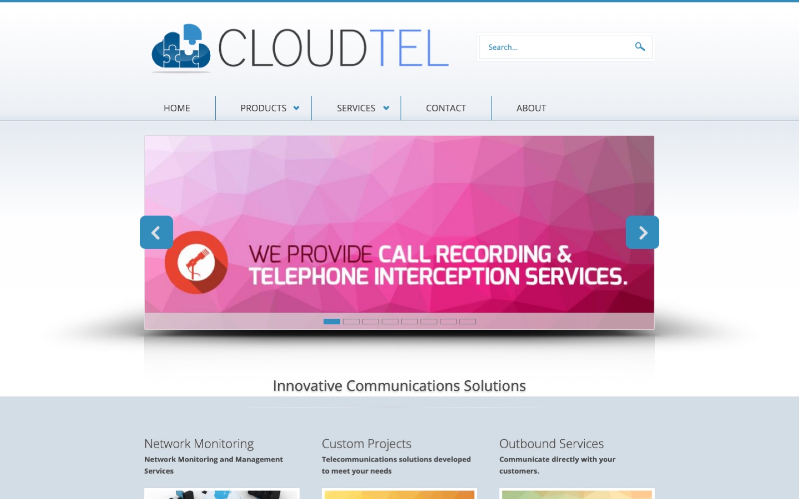
The mark: from six shapes to one stroke.
The old mark stacked a cloud and a jigsaw puzzle in a gloss gradient, six shapes explaining themselves at once. The new one is a single continuous stroke: a cloud drawn without lifting the pen, legible at sixteen pixels, at home on an invoice and on the side of a rack. Scroll, and watch one become the other.


The structure: from a filing cabinet to a narrative.
The 2012 site was organised like a filing cabinet: dropdown menus, a site search, eight slides in a carousel, and content behind Read more links. The rebuild is organised like an argument. One page that states what Cloudtel is, proves it with the track record, and ends at a way to make contact. Scroll here and both sites scroll with you. The 2012 page barely moves, because there was barely anything on it; the rebuild keeps going. That difference in depth is the difference in ambition.
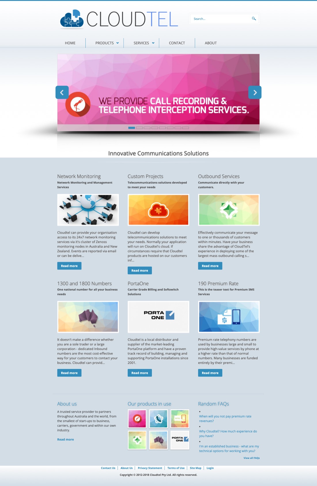
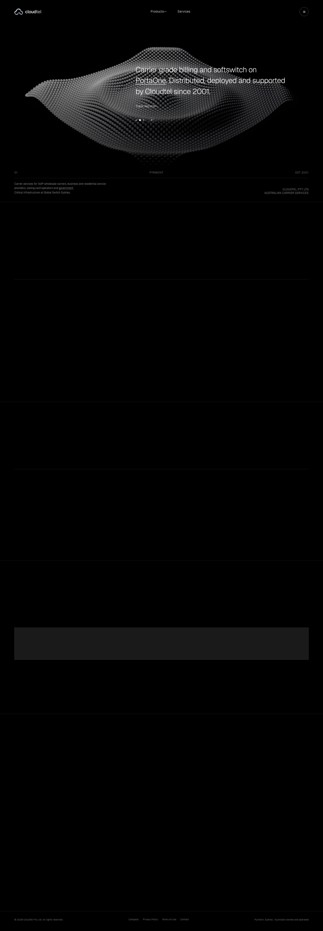
What modern actually meant.
Modernising is not a coat of paint. Each of these was a decision with a reason, and together they are the difference between a site that describes a business and one that carries it.
The same address, side by side.
One last look, in one frame. The line is yours; it follows the scroll.
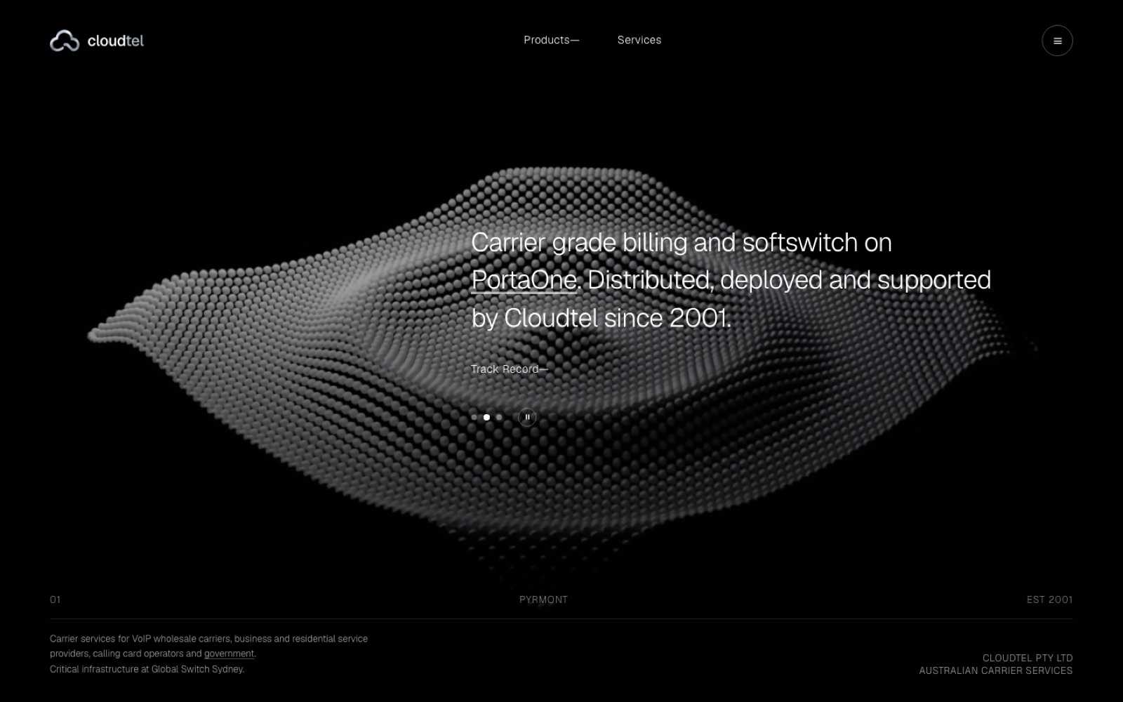
2012, and the rebuild at the same address
The rebuild shipped in 2026: new mark, new copy, new front end, designed and built end to end by one person and owned outright by the client. The live build is on the shelf as work 01, and the way the engagement ran, phase by phase, is written up on The Practice.